IOCO Store
Branding Guideline of IOCO Store
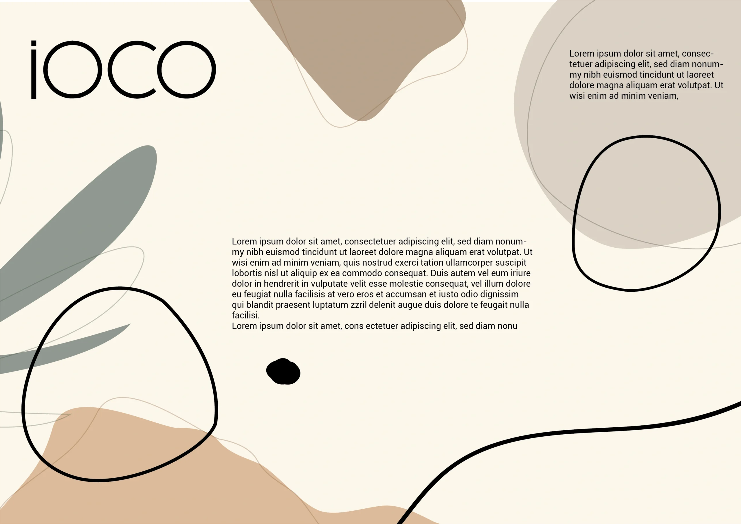
We collaborated closely with the IOCO team to develop a brand identity that captures the essence of modern femininity while maintaining a timeless aesthetic. Our approach focused on translating the brand’s philosophy into a refined visual language that feels both premium and approachable. The resulting brand system provides a flexible foundation for future growth, enabling IOCO to maintain consistency across marketing materials, social media, packaging, and in-store experiences while strengthening brand recognition.
Poise, Comfort, Universal & Effortless
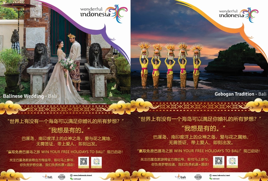
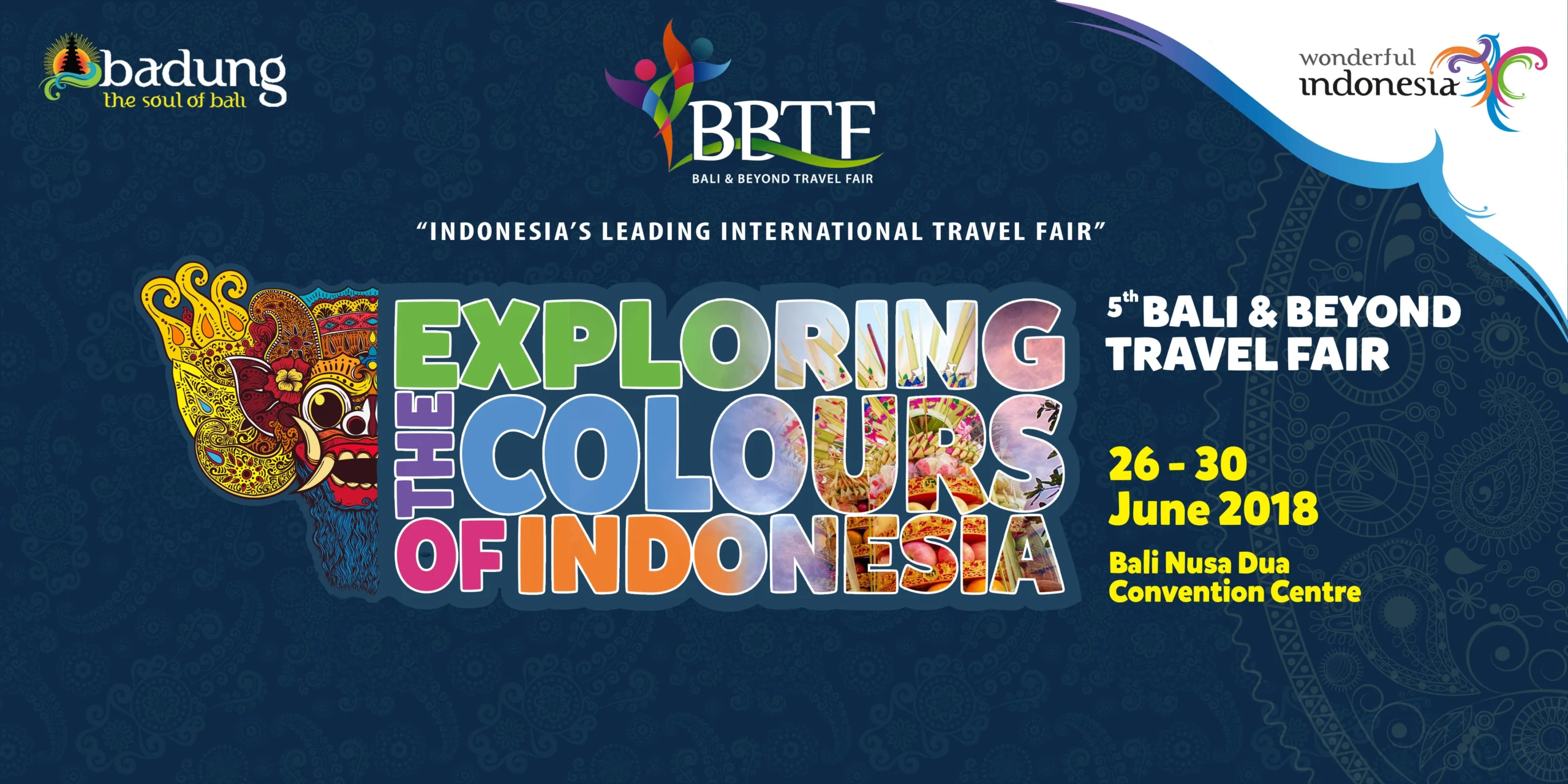
The Wonderful Indonesia campaign was designed to inspire travel by showcasing authentic cultural experiences and visual storytelling that resonate emotionally with audiences. By presenting Indonesia’s traditions, landscapes, and lifestyle moments, the campaign created a compelling narrative that encouraged curiosity and destination interest.
The campaign connected with diverse audience segments — from frequent travelers and urban professionals to families and young explorers — all seeking meaningful and memorable travel experiences beyond their borders.
Minimalism with Character
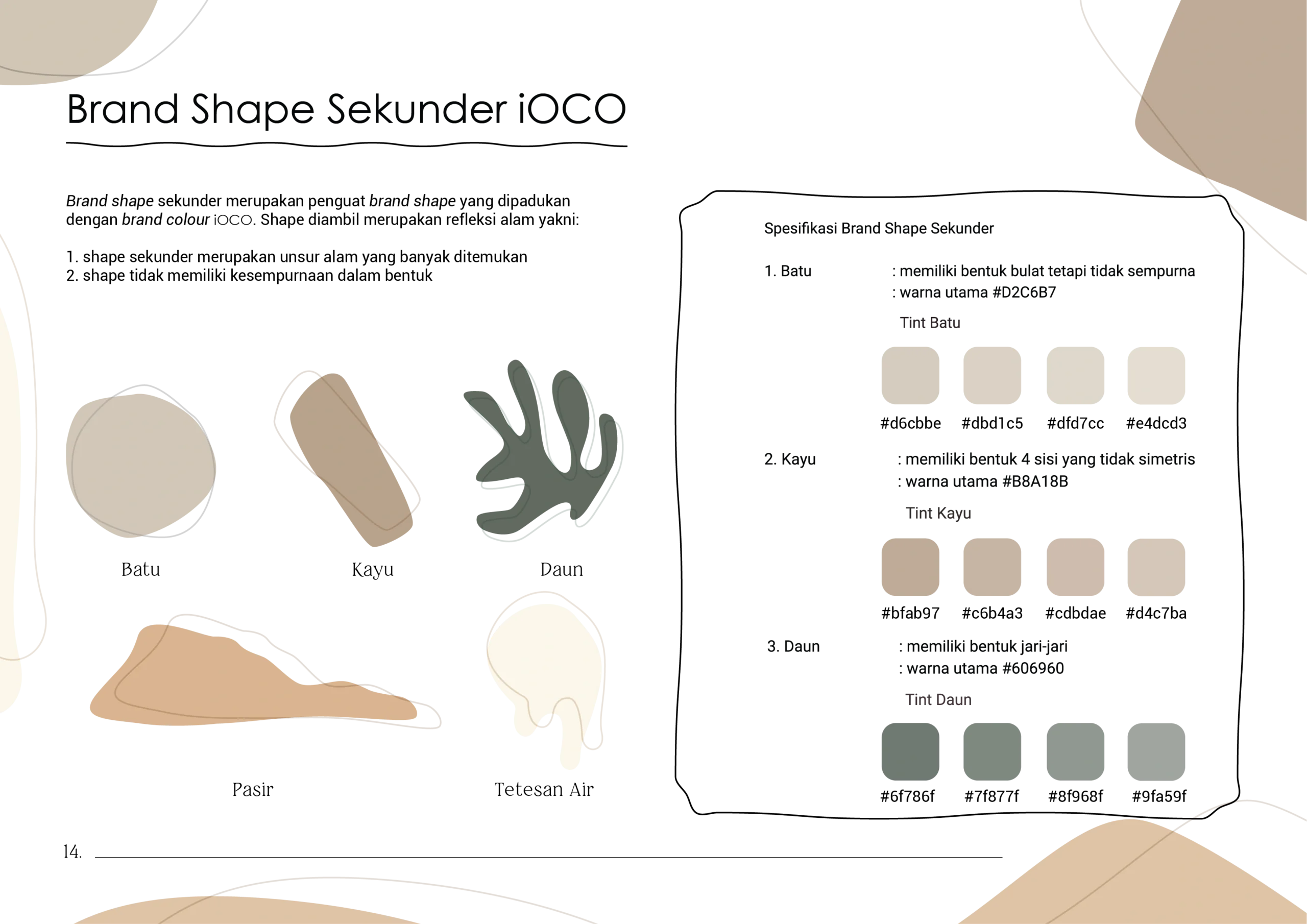
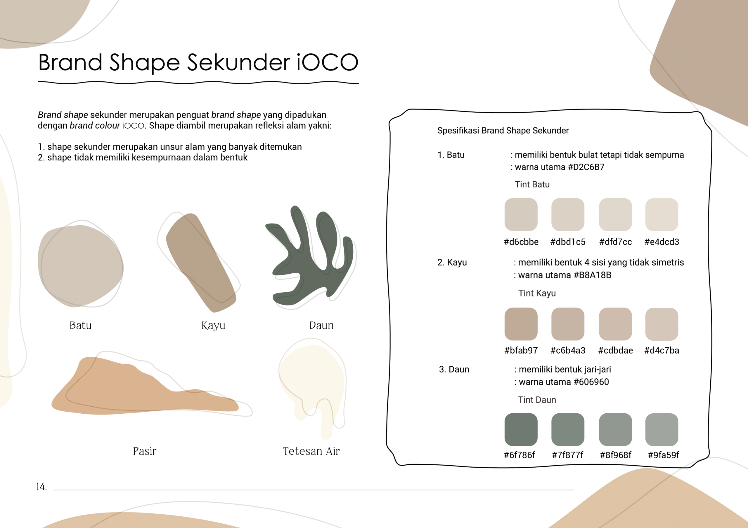
The visual direction was inspired by natural textures, neutral palettes, and organic forms that align with IOCO’s artisanal production philosophy. Rather than relying on overly decorative elements, the identity embraces clean typography and balanced compositions to convey sophistication and clarity.
This approach creates a brand presence that feels calm, confident, and contemporary.
Neutral Tones with Natural Warmth
The color palette draws inspiration from earthy and organic tones, reflecting both the artisanal craftsmanship and the relaxed lifestyle associated with Ubud. Soft beiges, muted browns, and natural hues create a sense of warmth, comfort, and authenticity.
These colors reinforce IOCO’s positioning as a refined yet approachable fashion brand.